
CTA placement for blog posts: where to put CTAs that actually get clicks
CTA Placement for Blog Posts: Where to Put CTAs That Convert
You spent two hours writing a post that genuinely helps your reader. You put the CTA at the bottom, published it, and watched the click-through rate sit at 1%. The post ranked. People read it. Nothing converted. That gap between traffic and action is almost always a placement problem, not a copy problem.
The temptation is to rewrite the button text or change the color. Sometimes that helps. More often, the issue is simpler: the CTA is sitting in the wrong spot for the reader's stage. A subscriber prompt at the top of a 2,000-word tutorial asks for commitment before you've earned it. A soft internal link buried in paragraph 14 of a bottom-funnel comparison post is too timid for someone ready to act.
CTA placement blog posts require conversion thinking, not design guesswork. Where you put the ask determines whether the reader feels pulled forward or pushed aside. This guide covers how to place CTAs by post type, how to write copy that makes the placement work, how to test without guessing, and how to automate the whole thing across a growing content library. 🎯
Why CTA placement changes what a blog post actually does
Every blog post has a job. Sometimes that job is to capture an email. Sometimes it's to move a reader to a deeper article. Sometimes it's to book a demo. The CTA is the mechanism that does that job, but only if it appears at the right moment in the reader's journey through the page.
Reader intent shifts as they scroll. Someone three sentences in is still evaluating whether to keep reading. Someone who just finished your third proof section has already decided you know what you're talking about. Those two readers need different asks at different moments.
Primary, secondary, and soft CTAs serve different functions
A primary CTA asks for the main conversion: subscribe, start a trial, download, book a call. One per post. A secondary CTA supports it, usually a lower-friction action like reading a related article. A soft CTA is an internal link woven into body copy that moves the reader forward without interrupting the flow. Each has its place. Stacking all three in the same paragraph creates friction, not momentum.
Single-goal pages outperform multi-ask pages
In my experience, posts that ask for one thing convert at a higher rate than posts that present multiple competing options. The math is simple: every additional action you offer splits the reader's attention. Pick the most important goal for the post. Let everything else support it rather than compete with it.
A blog post with one clear goal is easier to optimize than a post trying to serve every stage of the funnel at once.
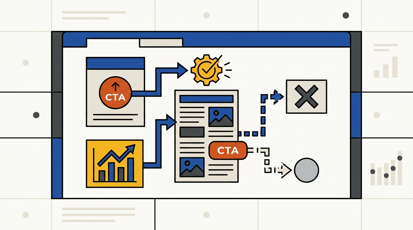
The manual CTA placement workflow for a single post
Before you drop a CTA block anywhere, answer three questions. What is the page goal? What does the reader know by the time they reach the CTA? And what's the lowest-friction next step from that point? Those three answers determine placement. Everything else is decoration.
Step 1: Name the page goal before you open the editor
Write the goal at the top of your draft doc. "This post should generate demo requests." "This post should drive subscribers." "This post should move readers to the pricing comparison." One goal per post. If you can't name it in one sentence, the post doesn't have a goal yet, and no CTA placement will fix that.
Step 2: Find the first value delivery point
Scroll through your draft and mark the first moment where the reader has received something genuinely useful. That's usually after the first major teaching section or proof block, somewhere between 300 and 600 words in for a standard post. That's your earliest defensible CTA position. Placing it before that point is asking for trust you haven't built yet.
Step 3: Use one primary CTA and one soft internal link
Place the primary CTA after the first value block. Add a soft internal link somewhere in the body, pointing to a related article that deepens the topic. For posts where the primary CTA is high-friction (like a demo request), the internal link does real work: it keeps readers who aren't ready yet moving through your content. Our piece on why the bottom CTA outperforms everything else covers when to lean on end-of-post placement.
The internal link is not a fallback. It's a deliberate second path for readers who need more before they commit.
Where CTAs belong by post type and intent
A tutorial and a comparison page are not the same document. They attract readers at different stages, which means the right CTA position shifts between them. Using the same placement template across every post type is one of the fastest ways to leave conversions behind. 📊
| Post type | Reader stage | Best primary CTA position | Max CTAs |
|---|---|---|---|
| Educational / how-to | Awareness to consideration | After first proof section (mid-article) | 1 primary + 1 soft link |
| Comparison / vs. post | Consideration to decision | Above the fold or after the verdict section | 1 primary + end repeat |
| Long-form guide | Mixed | Mid-article + end of post | 2 placements, 1 goal |
| News / opinion | Awareness | End of post only | 1 primary |
| Product-led post | Decision | Above the fold + end | 2 placements, 1 goal |
Scroll depth matters more than you think
In my experience, a meaningful share of readers on long-form posts never reach the final paragraph. Relying only on an end-of-post CTA on a 3,000-word guide means you're missing readers who drop off at the 60% mark. A mid-article placement at the 40% scroll point catches that group before they leave.
Comparison posts can handle earlier, higher-friction asks
Someone reading "Tool A vs. Tool B" has already decided they want one of them. They're not in learning mode. They're in choosing mode. A demo CTA or free-trial button near the top of that post, or immediately after the verdict section, fits their intent. Putting it only at the bottom of a comparison means they've already made their decision and closed the tab. Too late.

What to write in the CTA so the placement actually works
Good placement with weak copy still fails. The CTA text has to continue the conversation the article started. If your post just taught someone how to audit their content cluster, a CTA that says "Get Started" breaks the thread. The reader's brain has to do extra work to connect the offer to what they just read. That gap costs clicks.
Use outcome language, not action labels
- "See how your content cluster holds up" beats "Learn more" because it names a specific result the reader already wants after finishing the post.
- "Get the publishing cadence calculator" beats "Download now" because it tells the reader exactly what they're getting, not just that they're getting something.
- "Start tracking your ranking metrics" beats "Try it free" because it connects to the article's specific teaching, not a generic product promise.
- "Run your first CTA test in 15 minutes" beats "Sign up" because it sets a concrete time expectation and reduces perceived effort.
Reduce friction with specificity
Vague CTAs feel risky. Specific CTAs feel safe. "Book a 30-minute demo" is less scary than "Talk to sales" because the reader knows exactly what they're committing to. "See results in 7 days" is more compelling than "See results fast" because 7 days is a real commitment they can evaluate. Specificity does the trust work that generic language skips.
The CTA should feel like the next logical sentence of the article, not a gear shift into sales mode.
How to test CTA placement without guessing
Testing CTA position is worth doing, but only if you test one variable at a time. Changing the position, the copy, and the button color simultaneously tells you nothing useful. Pick position first. Run it for at least 2 to 4 weeks on a post with enough traffic to produce meaningful data, somewhere above 500 unique visitors per month as a floor.
What to measure beyond raw clicks
- Click-through rate on the CTA itself: the baseline signal, but not the whole story.
- Assisted conversions: did the reader who clicked the mid-article CTA eventually convert, even if they didn't convert that session?
- Downstream actions: did the CTA click lead to a second page view, a form fill, or a trial start within 7 days?
- Scroll depth before click: knowing whether readers click the CTA at 40% scroll or 90% scroll tells you whether your mid-article or end-of-post placement is doing the work.
Segment results by page type, not just by post
A placement that wins on a comparison post may underperform on a tutorial. Don't pool your results. Keep educational post data separate from bottom-funnel post data. A useful heuristic is to run at least 3 tests per page type before drawing conclusions about what placement works for that category. One winning test on one post is a signal. Three consistent wins across the same post type is a pattern worth scaling.
If you're running title tests alongside placement tests, be careful about overlap. Our guide on A/B testing article titles without losing rankings covers how to isolate variables when you're running multiple experiments on the same post.

How automation scales CTA placement across a blog
Manual placement works for 10 posts. It breaks down at 50. When you're publishing regularly, you need a rule set that handles placement decisions automatically, with a manual override for high-value pages. That's not a shortcut. It's a system.
Build rules by intent and post type
- Educational posts get a mid-article CTA block inserted after the second H2, plus an end-of-post block.
- Comparison posts get an above-the-fold CTA and a repeat after the verdict section.
- News and opinion posts get an end-of-post block only, no mid-article interruption.
- Long-form guides get a mid-article placement at the 40% mark and an end-of-post placement.
Those rules handle most of your publishing volume without manual decisions. The remaining posts, your highest-traffic pages, your pillar content, your cluster hubs, get manual review and override. That's where the six metrics that predict article ranking become useful: if a post is already pulling strong organic traffic, the CTA placement decision there deserves more attention, not the same automated default.
Build a review loop so the rules improve
Automation without feedback is just scheduled guessing. Set a quarterly review: pull CTA click data by post type, compare against your rule set, and update any rule that's consistently underperforming. The rule set should get smarter over time, not stay static from the day you built it.
Automation turns a good CTA strategy into a repeatable publishing rule. The rule still needs to be driven by data, not just convenience.
CTA placement mistakes that quietly kill blog conversions
Most CTA failures aren't dramatic. They're quiet. The post ranks, gets traffic, and just doesn't convert. These are the patterns I see most often when that happens. ⚠️
One universal CTA block across every post
A demo request CTA on a top-of-funnel awareness post is asking a reader who just met you to marry you. The mismatch between the reader's stage and the ask creates friction that no amount of button color optimization will fix. Match the offer to where the reader is, not where your sales team wants them to be.
Placing the CTA before the reader has received enough value
If the CTA appears in the first 200 words of an educational post, you're asking for trust before you've demonstrated competence. The reader hasn't seen your proof yet. They don't know if you know what you're talking about. Wait until after the first substantive section, at minimum 300 to 400 words in, before making the primary ask.
Too many competing actions on one page
Four CTAs with four different goals is not a strategy. It's a menu. Readers faced with too many options often choose none. Pick one primary goal per post. Let internal links serve as the secondary path. Keep the hierarchy clear: one main ask, one supporting link, nothing else competing for the click. Our article on when to consolidate articles touches on how competing goals across similar posts create the same decision paralysis at the site level.
Frequently Asked Questions
Where should a CTA go on a long blog post?
For posts over 1,500 words, use two placements: one after the first major teaching section and one at the end. Both should point to the same goal. Two placements, one conversion target. Splitting them across different offers adds confusion rather than coverage.
How many CTAs should a blog post have?
One primary CTA, repeated at most twice on long posts. Add one soft internal link as a secondary path for readers not ready for the main ask. Anything beyond that starts competing with itself. In my experience, posts with multiple distinct CTA offers convert at a lower rate than posts with a single clear ask.
Should the CTA go above the fold on a blog post?
Only on high-intent pages where the reader already knows what they want: comparison posts, product-led posts, or posts targeting decision-stage queries. On educational or awareness posts, above-the-fold CTAs ask for too much too early. The reader needs to receive value before they're ready to act on it.
How do I know if my CTA placement is working?
Track CTA click-through rate, assisted conversions within 7 days, and scroll depth at the moment of click. A CTA that gets clicks but produces zero downstream actions (form fills, trial starts, second page views) is placed at the wrong stage. The click is a signal. The downstream action is the conversion.
How often should I test CTA placement?
Run each placement test for at least 2 to 4 weeks on posts with over 500 monthly visitors. Test one variable at a time: position first, then copy, then design. Quarterly reviews of your full CTA rule set keep the system improving rather than stagnating on assumptions you made months ago.
Ranksector
Try Ranksector to build a CTA placement system that scales with your content library. Start by mapping your top 10 posts to a post type, assign a placement rule to each, and let the framework handle the defaults while you focus on the posts that matter most. See how Ranksector turns a manual placement decision into a repeatable publishing standard.