CTA Placement for Blog Posts: Inline vs End-of-Article CTAs Explained
✅ CTA placement: why end-of-article CTAs convert differently from inline ones quick guide You might also find our guide on Why Your Article's Bottom CTA Outperforms Every... helpful.
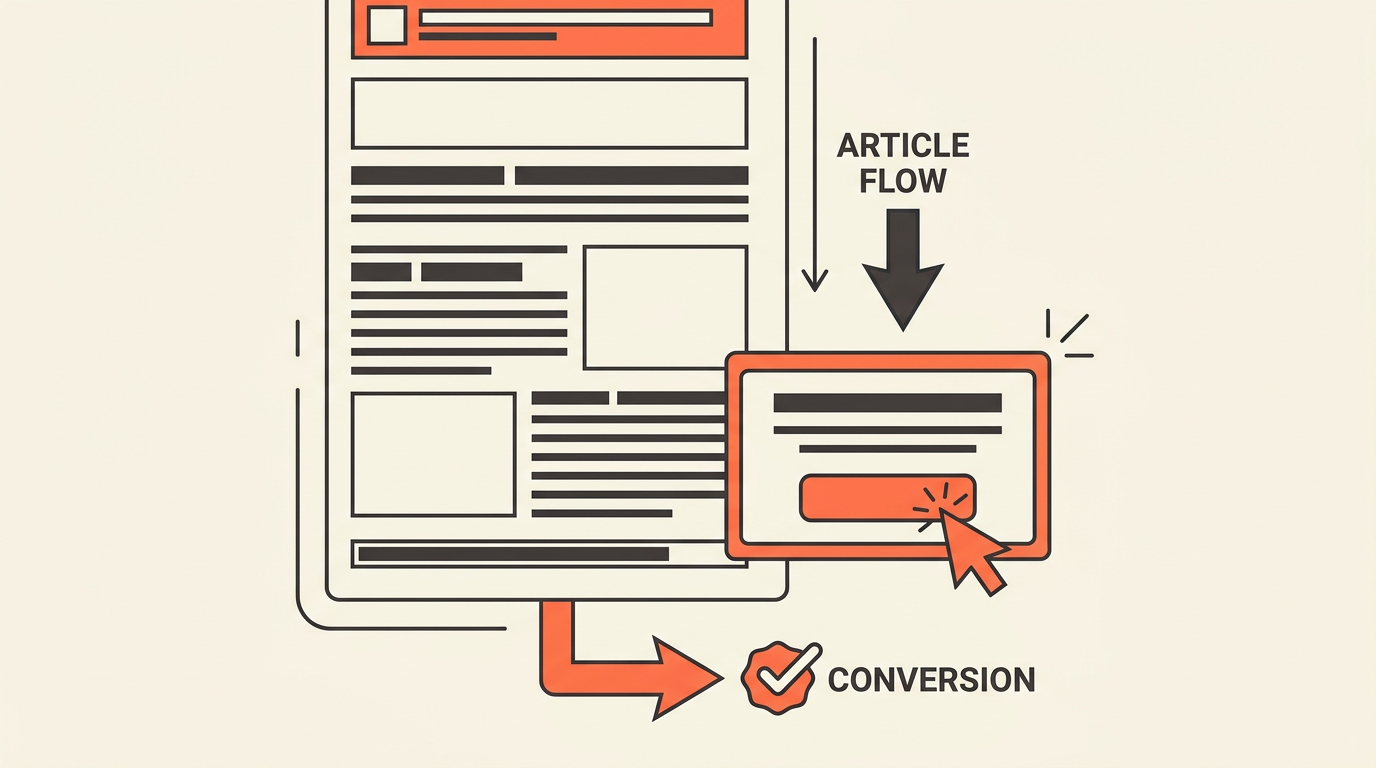
CTA Placement: Why End-of-Article CTAs Convert Differently
You spent 3 hours writing a blog post, added a CTA button in the middle, and watched it get a 0.4% click rate. So you moved the button to the top. Same result. Then someone suggested putting it at the end, and suddenly the rate climbed to 2.1%. You changed nothing in the copy. You changed nothing in the design. You only changed where it appeared.
That gap is not random. CTA placement: why end-of-article CTAs convert differently from inline ones is one of those questions that sounds simple but hides a real behavioral explanation. The button is the same. The reader is not.
Where a CTA appears on a page determines what mental state the reader is in when they see it. Get the timing wrong and even a strong offer gets ignored. Get it right and the same offer feels like the obvious next step.
Why placement changes conversion on blog content
The interruption problem
Inline CTAs interrupt. That is not always bad, but it is always a trade-off. When a reader hits a CTA button 300 words into a 1,500-word post, they have not finished the argument yet. You are asking them to act before you have finished persuading them.
Some readers will click. Most will scroll past and keep reading. A useful heuristic is that the click rate on an early inline CTA often reflects impulse, not conviction. Impulse clicks tend to produce lower downstream conversion quality.
End-of-article placement works differently. The reader has already consumed the full argument. The CTA does not interrupt anything. It answers the natural "what now?" question that forms after a reader finishes a post.
Reader intent shifts as the page scrolls
Think of a blog post like a funnel inside a funnel. A reader who lands on your post is already in some stage of awareness. But their intent level also changes within the post itself as they read.
At the top, they are evaluating whether the post is worth their time. In the middle, they are absorbing the argument. At the bottom, they are either convinced or not. That final state is the most action-ready moment in the entire reading session.
A CTA placed at that moment catches a reader at peak persuasion. One placed at the 30% scroll mark catches a reader who is still deciding whether to keep reading.
The same copy, different context
"Start your free trial" reads differently depending on where it appears. At the top of the page, it feels presumptuous. The reader barely knows what the product does. At the bottom of a post that just explained exactly why they need it, the same phrase feels logical.
Copy does not exist in isolation. It exists inside a reading experience. Placement sets the context before the copy even has a chance to work. That is why changing position often outperforms changing copy when you are diagnosing a low-converting CTA.
How end-of-article and inline CTAs behave differently
A direct comparison by reader state
| Factor | Inline CTA (mid-article) | End-of-article CTA |
|---|---|---|
| Reader attention level | High but still rising | Fully engaged or decided |
| Persuasion stage | Partial | Complete |
| Best offer type | Low-friction (newsletter, free resource) | Higher-commitment (trial, demo, consultation) |
| Click motivation | Curiosity or impulse | Conviction or readiness |
| Drop-off risk | Lower (reader may not finish) | Higher (only finishers see it) |
| Downstream conversion quality | Variable | Generally stronger |
Why long-form posts often need both
On a 2,500-word post, readers often exit before the final paragraph. In my experience, scroll depth on long-form blog content tends to drop sharply after the 60% mark. If your only CTA is at the bottom, you are invisible to those readers entirely.
A sensible structure for long posts: one lower-friction inline CTA placed after a strong proof point or explanation, and one primary CTA at the end. The inline option catches readers who are ready early. The end option catches readers who needed the full argument.
This is not about adding more CTAs. It is about matching CTA type to reader state at each placement. More CTAs without that logic just adds noise. For a deeper look at where to place CTAs across different post formats, the CTA placement for blog posts guide covers the broader placement map.
Inline CTAs intercept. End-of-article CTAs convert. The best strategy usually needs both, but only when each placement matches what the reader is ready to do at that exact moment.
When to use an end-of-article CTA
Educational content that builds a case
If your post teaches something before it sells something, the end CTA is almost always the right primary placement. The reader has spent 5 to 8 minutes with you. They have learned something. The CTA now feels like the logical continuation of that experience, not an interruption of it.
This is especially true for posts targeting bottom-of-funnel keywords. A reader who searched "best CRM for 10-person sales teams" and read your full comparison post is far more ready for a "book a demo" CTA at the end than a reader who found a top-of-funnel explainer.
High-commitment offers
Demo requests, free trial sign-ups, and consultation bookings all require trust that takes time to build. Kissmetrics notes that CTA copy should match the visitor's funnel stage, and a high-commitment ask works best when the reader has completed the persuasion journey.
Placing a "book a 30-minute call" CTA in the middle of a post that has not yet made the case for why the call is worth 30 minutes is a friction mismatch. That offer needs the full argument behind it first.
When the article answers a specific question
Question-based posts ("how do I...", "what is the best...", "why does...") have a natural resolution point. The reader came with a question. The post answers it. The CTA at the end says: here is what to do with that answer.
That sequence feels earned. The reader does not feel sold to. They feel helped, and then offered a next step. That is the conversion psychology behind a well-placed end CTA. Webless.ai's analysis of CTA placement and bounce rate supports this: readers who reach the end of a post are already primed for a next action.
When inline CTAs outperform end placement
Long articles with high drop-off risk
A 3,000-word post is not read the same way a 600-word post is. Scroll depth data shows that longer posts see sharper attention drop-off. If your post is over 2,000 words and your only CTA is at the bottom, you are betting on readers who finish. That is a smaller audience than you think.
Placing an inline CTA after a strong section, say after a case breakdown or a specific data point that lands well, captures readers at a moment of rising intent. Lucky Orange connects CTA placement to funnel thinking: the offer should match where the reader is in their decision, not where the layout is convenient.
Lower-friction offers for discovery-stage readers
A reader in the middle of a post is still in discovery mode. They are building context, not making decisions. That is the right moment for a low-friction offer: a newsletter sign-up, a downloadable checklist, a free tool. Something that adds value without demanding commitment.
"Download the CTA placement checklist" works mid-article. "Book a 45-minute strategy call" does not. Match the ask to the moment. A useful heuristic is that the commitment level of the offer should roughly match how far the reader has progressed through the post.
Put the CTA where intent spikes, not where the layout has space. A good inline CTA feels like the next step in the reading experience, not a detour out of it.
After a strong proof point or example
Heatmap's CTA best practices guidance emphasizes placement and visibility as the first variables to optimize. But visibility alone is not enough. An inline CTA placed immediately after a compelling example or a specific data point that resonates lands differently than one placed between two generic paragraphs.
The rule here is simple: place the inline CTA at the moment the reader is most likely thinking "I want more of this." That is usually right after a proof point, not before one.
A manual testing workflow for CTA placement
Map sections to intent stages before you test
Before you run any test, read your own post and mark each section with an intent label: awareness, consideration, or decision. This takes about 10 minutes and prevents you from testing placements randomly.
- Awareness sections introduce the problem. Readers here are orienting, not deciding. Low-friction CTAs only.
- Consideration sections explain options and trade-offs. Readers here are comparing. Inline CTAs with specific, relevant offers can work.
- Decision sections resolve the argument. Readers here are ready. This is where your primary CTA belongs.
Once you have the map, you know which placements are even worth testing. You are not guessing anymore.
Test one variable at a time
Protocol80 recommends A/B testing placement, copy, color, and button size as separate variables. That sequence matters. In my experience, placement has the largest effect on click rate. Test that first before you spend time on button color.
A simple two-cell test: version A with end-only placement, version B with an inline CTA after section 3 plus the end CTA. Run each version for at least 500 sessions before drawing conclusions. Anything less and the variance is too high to trust.
Measure downstream, not just the click
Click-through rate on a CTA button is not the metric that matters most. Spirra Digital's CTA placement guide makes this point clearly: a high-click CTA can still underperform if it sets the wrong expectation and produces low-quality leads downstream.
Track the full path: button click, form completion, trial activation, and, where you can, pipeline contribution. A CTA that gets a 3% click rate but a 40% form completion rate beats one that gets a 6% click rate and a 15% form completion rate. The second number is the one that pays.
Test placement before you test color. The position of a CTA changes what the reader expects from it. Copy and design only matter after placement is doing its job.
What to measure so you do not optimize the wrong thing
The metrics that actually tell you something
Teams often track CTA click rate and stop there. That is a mistake. Click rate tells you whether the button was visible and compelling enough to tap. It does not tell you whether the click led to anything useful.
- Form completion rate tells you whether the offer matched the reader's expectation after the click.
- Trial activation rate tells you whether the reader who signed up actually engaged with the product.
- Demo attendance rate tells you whether the consultation CTA attracted genuinely interested leads.
- Pipeline contribution tells you whether the CTA placement is producing revenue-relevant outcomes, not just vanity metrics.
Segment by traffic source and device
Formx.stream's CTA placement breakdown notes that device type affects whether a CTA is even seen. On mobile, a CTA placed at the 70% scroll mark may never appear above the fold on a smaller screen. A CTA that performs well on desktop can be nearly invisible on a 375px viewport.
Segment your results by device. Also segment by traffic source: organic search readers behave differently from social readers. Organic readers tend to have higher intent because they searched for the topic. Social readers are often in discovery mode and need a lower-friction offer.
Revisit high-engagement, low-conversion pages
If a post has strong time-on-page (say, over 4 minutes average) but a CTA click rate under 1%, the engagement is there but the CTA is failing. That is almost always a placement or copy mismatch, not a traffic quality problem.
High engagement with low conversion is a signal worth acting on. The reader found the content valuable enough to stay. The CTA did not feel like the right next step. Adjust placement first. If that does not move the number, revisit the offer itself.
CTA placement rules that work on SaaS blog posts
One primary CTA, one supporting option at most
Wit Group Agency's CTA design guidance is direct on this: one primary action per page. Multiple competing CTAs split attention and reduce the likelihood of any single action being taken. If you need a secondary CTA, make it clearly subordinate in size, color, and position.
A common pattern that works: primary end-of-article CTA for the main conversion goal, secondary inline CTA mid-article for a lower-friction offer like a newsletter or content download. Two CTAs, two different intent levels, no competition between them.
Match CTA language to the post's promise
If your post promises to explain how CTA placement works, the closing CTA should not say "buy now." It should say something that continues the educational journey or offers the next practical step. "See how we handle CTA placement for 50+ posts a month" is more congruent than a generic "get started."
Congruence between article promise and CTA language reduces the friction of clicking. The reader does not feel like they are being switched from one conversation to another. The CTA feels like the post continued. That is the standard to aim for.
Mobile placement is not optional
Kissmetrics recommends thumb-friendly sizing and scroll-friendly placement for mobile CTAs. A button that requires a precise tap on a 44px target is going to underperform on mobile, regardless of how well the copy is written.
Minimum tap target: 48px by 48px. Minimum padding around the button: 12px on all sides. Check that the CTA is not hidden behind a sticky header or a cookie banner on smaller screens. These are small details that cut click rates by a measurable amount on mobile traffic.
If the CTA feels like a mismatch with the post, the placement is probably wrong before the copy is wrong. Fix the position first, then the words.
Frequently asked questions
Do end-of-article CTAs get fewer clicks because fewer readers finish the post?
Yes, they see fewer absolute clicks because only a fraction of readers reach the bottom. But the readers who do finish tend to be more qualified and more ready to act. In my experience, the conversion rate from click to form completion is stronger at the end of a post than mid-article, which often offsets the lower raw click volume.
How far into a post should an inline CTA appear?
A useful heuristic is to place the first inline CTA no earlier than the 30% scroll mark, and only after a section that delivers clear value. Placing it earlier tends to interrupt the reader before they have enough context to act with intention. After a strong proof point or a specific example is usually the right trigger.
Should I use a sticky CTA bar instead of inline or end placements?
Sticky bars keep a CTA visible throughout the scroll, which maximizes visibility. The trade-off is that they can feel intrusive and may reduce perceived content quality on educational posts. Heatmap recommends testing sticky placement separately from inline and end placements rather than assuming it outperforms both.
What is the right CTA for a top-of-funnel blog post?
Top-of-funnel readers are in awareness mode. They are not ready for a demo request or a trial sign-up. Lower-friction offers work better here: a newsletter subscription, a relevant content download, or a link to a related post that moves them deeper into the funnel. Match the commitment level of the ask to where the reader actually is.
How many CTAs is too many on a single blog post?
In my experience, more than 2 distinct CTAs on a single post creates competition for attention and reduces the click rate on each individual CTA. One primary CTA and one supporting CTA is the practical ceiling for blog posts. If you need more, it usually means the post is trying to serve too many audiences at once.
Ranksector
Try Ranksector to plan, publish, and test CTA placement across your entire content library without rebuilding each post manually. See how Ranksector maps reader intent to placement rules so your CTAs match the right moment at scale. Start with your highest-traffic posts and let the data drive the next decision.